
SAVR
Project Overview:
Savr is a new startup that shows hundreds of recipes, and cooking tips for at-home chefs. They have an active community of users who rate and review recipes for other users. Although Savr receives lots of positive feedback on the quality of its recipes, there have recently been negative reviews about some of its more complex recipes.


My Role:
User Research & Analysis Ideations
Wireframes UI & Prototyping Visual Design
Tools:
Figma Invision
DAY ONE
Day 1: Understand/Mapping
Day one consists of starting at the end which is finding the intended solution. After going through the compiled research, users interview, and persona most users have the same problem while using the app.
Problem:
Savr received negative feedback from users who had difficulty following recipes. Users commonly face problems with timing, preparation, and order of steps.
Insight:
Users are struggling to follow the step-by-step recipe by just reading. They tend to struggle to keep track of their dishes and need help with the cooking process. Users need to visually see the process and how-to techniques that are out of their cooking skills and knowledge. To make users feel confident while following the recipe and make the process stress-free.

DAY TWO
Day 2: Sketching
Competitor Benchmarking
Before proceeding to the sketches, here are some related products that would help solve the Savr’s problem. Using the Lighting Demos method to gather some useful solutions that would help generate new ideas.
SideChef is quite similar to Savr as it offers a lot of recipes but Sidechef focuses on specific diets and quick meals. Great interface and easy to navigate.
BigOven also offers a variety of recipes but focuses on meal prep recipes. BigOven has a great interface and visual elements that are easy to follow.
Epicurious focuses on recipes featured in well-known cooking books. Has a variety of recipes by meal, diet, occasion, ingredients, and more. Great interface with lots of visual elements and easy-to-follow recipes.
Observations
Overall observations from the competitor's recipe app, they focus more on diet and how fast and quickly can users do the recipes on their app. It’s not really solving the user's problem which is following the recipes step-by-step. Though competitors have great UI elements that could help solve the visual side of the user's problem.
Ideation
Before proceeding to sketches, here are some ideas gathered from the lighting demos.
-
Preparing the ingredients
-
Implementing videos in the cooking steps
-
Demonstrations of cooking techniques
-
Overlapping steps
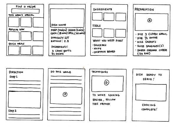
Sketch
Critical Screen
Added videos on each screen where most users get confused. Having videos to follow the process of preparation, overlapping steps, and other cooking techniques would help users follow through with the recipes without feeling frustrated.


.png)


DAY THREE
Day 3: Decide
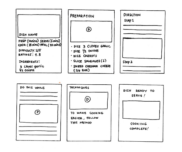
Created a detailed storyboard guide to plan my prototype. Deciding on the final screens from my Day 2 sketch to create a foundation for my prototype.
Storyboarding/Brainstorming
Selected the screens that would help the users in the best way possible while following the recipe.
.png)
Preparing the ingredients procedure with a video on how to prepare the ingredient for users to follow along.
Videos in between the step-by-step cooking direction help the users visualize the process.
Detailed Information about the dish with a photo for a user to visually see the dish.
Added a breakdown of prepping, cooking, and total time.
Adding in between process and cooking techniques would help users who are just learning how to cook.
And last, the final screen to assure users they successfully finish the following recipe.
.png)
Final Sketch
Refined the final screen that will be used for the UI Design.
DAY FOUR
Day 4: Prototype
On the fourth day of the design sprint, creating the prototype in Figma.
-
A scroll-down approach to the recipe for an easy read.
-
Detailed information such as overall time to cook and ingredients need for users who are browsing easy recipes for users to know if the recipe is doable.
-
Book mark button is available to save the recipe while users are browsing for the recipe.
-
In between videos to help users visualize the cooking process and for users who prefer following the videos instead of reading the instructions.
-
Overlap steps and cooking techniques to guide users who are just beginning to cook to avoid stress while following the recipe.

DAY FIVE
Day 5: Test
Tested the prototype on users and here are the findings.
Findings
To analyze the findings from the interviews, here are the participant's feedback to better understand if the solution fixes the previous user's issues:
General notes from participants
-
Yes, it meets the criteria. It has all the things I’m looking for before I start cooking.
-
You have a head start on the process. The video was helpful because most of the time I don’t know how to do certain processes.
-
Yes because sometimes you could get lost when you’re reading it. The video is helpful as it shows step-by-step procedures of which ingredients go first and what's next.
-
I usually overlap steps and commonly use them. I like doing other things while waiting.
-
Cooking techniques are very helpful for beginners.
-
It looks pretty. Easy to navigate. Everything layout is seamless. No confusion and it’s clear.
Summary
Through testing and having users test the prototype, I was able to fix some minor issues. Issues like having videos instead of following the recipe directions. Users like having video clips on each step as it is easy to follow the process visually. Users also like how clean the overall look of the app. One user pointed out that sometimes recipes would give too much unnecessary information and that can be distracting. Users were satisfied with the overall experience of the app.
My overall learning throughout the Design Sprint was that even though the process was quick, it solved the issues. In the short period of 5 days, good quality work was able to be achieved without sacrificing anything needed to resolve the problem.